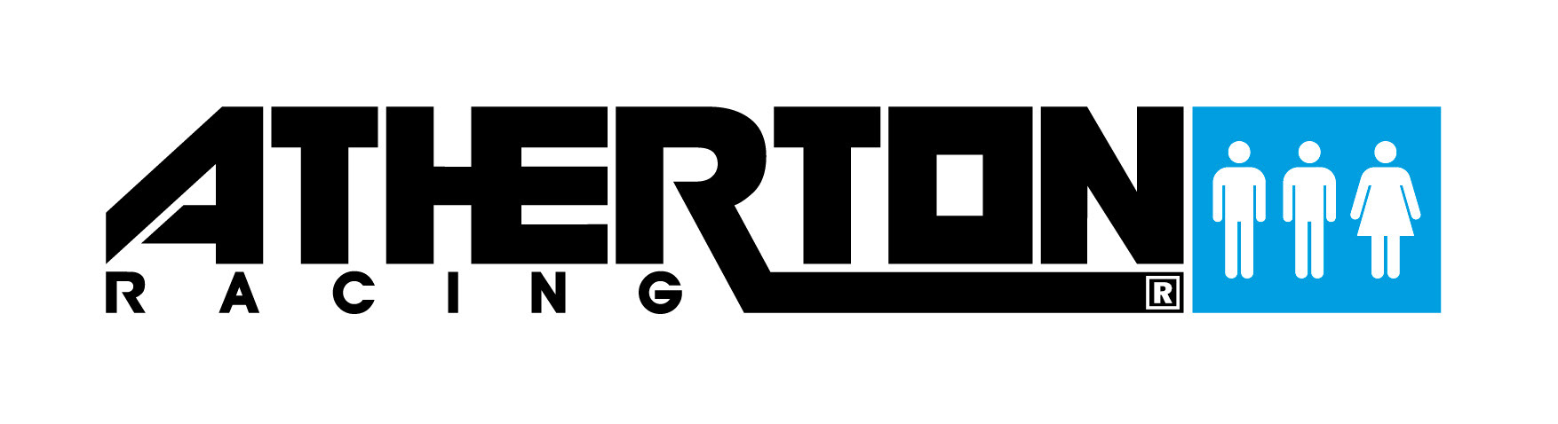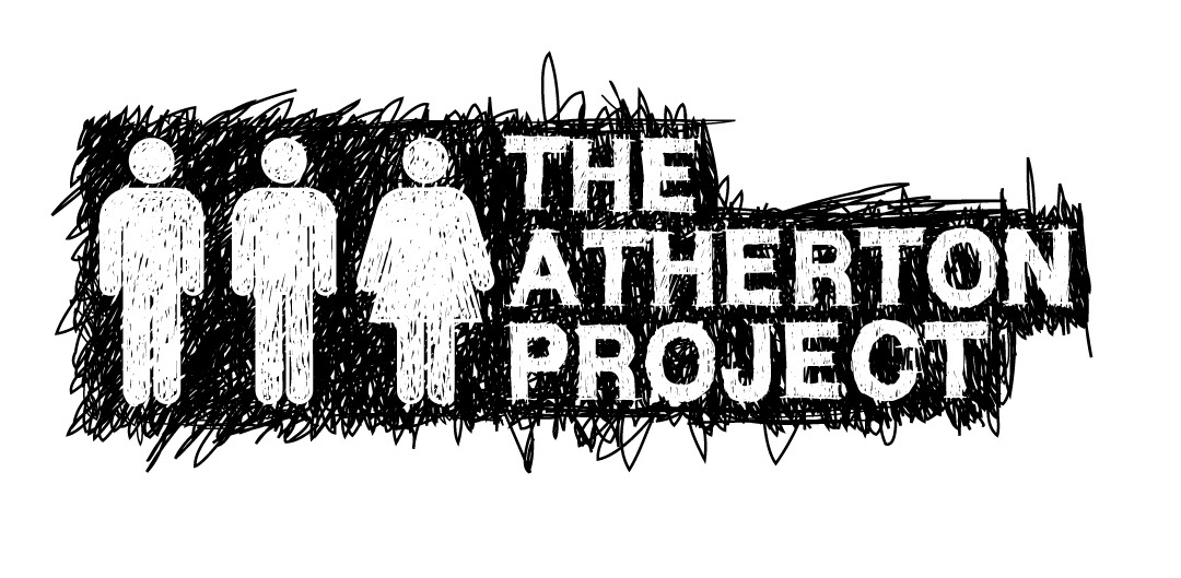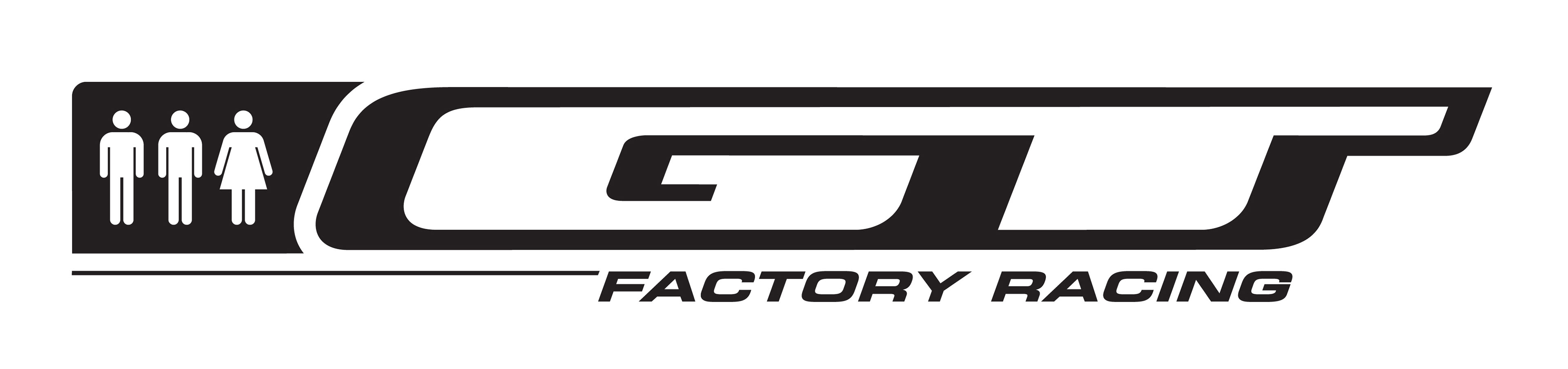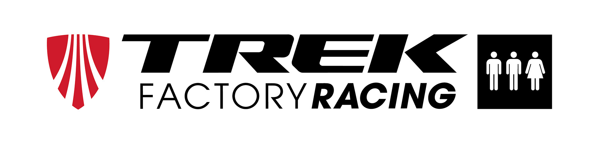
Concept and creation of a logo for Atherton Racing that would represent the unique nature of the team, being made up of two brothers and a sister, Dan, Gee and Rachel. The idea was that the logo could stand on it’s own but also be incorporated with sponsors logos moving forward and evolve as the livery of the team and their title sponsors changed over time.
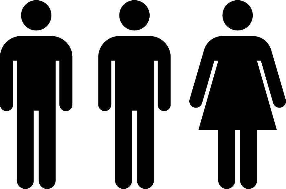
The Real Characters, as the logo is called, have come a long way with the team since the initial idea.